IBM Cognos 10: Initial Thoughts and Reactions
Cognos 10 was released on October 25th, with much fanfare (and fireworks – quite literally) at IBM’s Information on Demand conference in Las Vegas. I’ve been exploring the interface and feature set within my own test environment the past few days and here are a few early conclusions, including what I would consider to be the top three high-impact features of this release.
1. Business Insight Advanced
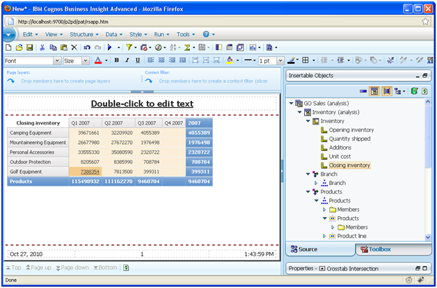
They’ve taken analysis studio, query studio, and elements of report studio and condensed them all into a single intuitive, uniform, and incredibly responsive user experience.
The interface is F-A-S-T. Both OLAP and Relational package metadata are quick to return. Even DMR members in the metadata tree materialize instantaneously in my test environment.
The UI is intuitive, clean and uniform regardless of data source type or package. No longer do power users need to learn 2-3 studios to do their job. Best of all, the interface is incredibly similar to report studio which creates a continuous experience for those users who graduate to the latter full-fledged development environment.
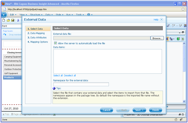
2. External Data Wizard
I can’t even begin to count the number of times my clients have had external data stored in a spreadsheet that they’ve wanted to incorporate into a report. There have been a few “hacks” to accomplish this in the past using some crafty JavaScript, but never an interface that is as polished and easy to use as this one. Everyone is talking about Agile BI these days and here is a software feature that supports it. Get the data you need into the report today and work towards the long term solution in a subsequent sprint.
3. Active Reports
During the week of Information on Demand, I observed a great tweet on the #Cognos10 stream that more or less sums up my feelings on this new feature:
I’m starting to understand the #cognos10 disconnected reports. It’s so more than just letting execs run dashboards on airplanes. #iodgc
One of the more complicated challenges that organizations encounter is getting content out to external users. These can be sales reps, agents and agencies, stores, franchises, etc. The bottom line is that everyone in or around your organization, whether or not they are tethered to your intranet, can extract the value from a rich interactive analytical experience. I think distributed active reports may be the solution for a lot of those scenarios, instead of trying to facilitate direct access to Cognos Connection for your remote users.
Other Noteworthy Features
I like Business Insight (or as some may know it in its prior form, Go! Dashboard) as an elegant answer to the call for better dashboarding for the masses. This concept is the evolution of self service which has traditionally been more often about answering specific granular questions at a whim, and less about building your own tailored high level view of the world. I think by making dashboarding more accessible, it’s going to help organizations move faster along that BI maturity curve from a pure reporting culture to a true analytical culture.
Lifecycle Manager has garnered a lot of buzz, which surprises me because it’s a tool that’s been around for 3-4 years under the name of Upgrade Manager. It’s always been provided as a free download to any customer. I have yet to unwrap this latest iteration, but from what I can tell from the demos, it’s the same old upgrade manager we know and love. Regardless, it’s an outstanding utility that everyone should be using to manage upgrades, migrations and regular changes to content. There is a time investment up front, but it’s usually well worth it.
Charting has been updated to keep up with the Joneses. Most of the additions are in the form of “chromed” or 3D chart variations which as a student of both Edward Tufte and Stephen Few, I find rather disappointing. To be honest I’ve probably had more client requests for shiny 3D charts than true visually quantitative ones, so such is the status quo. What is noteworthy is the addition of a Bullet Chart, which is a much better quantitative alternative to a gauge chart.
Sadly, there are still no tree maps which are a superior alternative to the Marimekko chart that has been included for some time. I guess if I had to pick a single area of potential enhancement for which I had higher expectations, it would have to be charting.
Dynamic Query Analyzer is another potential killer app for Cognos administrators. It has long been a tedious process of troubleshooting and tuning queries in Cognos, that typically involves multiple applications and a lot of cutting and pasting. This utility (built on the eclipse platform) brings it all together in one place and provides a visual interface for tuning and debugging your problem queries. I have yet to fully test it, but I have high hopes for it as an indispensable asset for Cognos administrators and developers everywhere.
Conclusions
The bottom line is that this is an outstanding release, with so much more under the hood in terms of performance improvements than I could ever begin to experience in my test environment. I very much look forward to the opportunity to help guide my clients into production on Cognos 10, be it a migration, upgrade or new implementation.


