The Dashboard Design DL: 5 Steps to Get Started

Data is scary. It comes in many types and requires even more tools to manage, which can make finding the information you’re looking for an intimidating prospect. Luckily, dashboards can help you get relevant data in a format that works for the people who need it most. This article will explore the core concepts behind good dashboard design and put you on the road to making sense of all that data out there.
There are five steps you should follow to start building awesome dashboards:
- Know your audience.
- Ask the right questions.
- Make insights actionable.
- Emphasize what’s important.
- Group content logically.
Let’s explore.
1. Know Your Audience

To create an effective dashboard design, you have to see from your audience’s perspective. This means you first need to figure out who your audience is. Having too many people in the audience who don’t have the same interests in mind can lead to a dashboard that doesn’t make sense for anyone. You can end up with too much clutter or worse, a dashboard that is completely ineffective in reaching any of the users’ goals.
For example, say you build a dashboard for a more vocal user who’s very concerned with operational efficiency, but in reality the main dashboard user is the marketing manager, who makes decisions based on the dashboard far more regularly than the other user. In this case, you’d want the marketing manager’s priorities to stand out, and just showing efficiency data isn’t going to help someone in that position much in terms of deciding where to focus their resources, which will lead to a dashboard design that’s not effective for its true intended user. Instead, looking at conversion rates, sales opportunities, or how much is spent on advertising would be better.
You need to be careful and make sure that you’re talking to the right people to get the dashboard to answer the right questions, which brings us to step two…
2. Ask the Right Questions

You have to figure out what answers your audience is trying to get out of their dashboard design. It’s very important to make sure you understand how the audience is really going to be using your dashboard in order to build it correctly. You want to avoid too many questions that don’t relate to each other. You want to tell a cohesive story so that the pieces all fit together in the end.
Your users may think they know the questions they want to answer, but the key is to always ask them why. For example, if your main user is a tech manager and they tell you they’re trying to see how much of the budget was spent in each department, you have to think about what they’ll actually do with the answer to that question. Most likely, they’re really looking for who spent the money and why, not what department and how much.
If you figure out why the users you’re building for want to ask the questions they’re asking, you’ll often find that the root desire behind the question is really what you need to be answering.
3. Make Insights Actionable

While you want the dashboard you create to answer the questions you uncovered in steps one and two, you also need to make sure people can act on the answers they get. You can lay the groundwork for this in the previous step by making sure you’re continually asking why instead of just how.
If you stay focused on the why, you can get to what actions should result from the dashboard findings. If we go back to the scenario with the tech manager used in step two, you can see that giving them the ability to know exactly who spent money and why helps them know who to follow up with and what to discuss so they can get the budget back in order for the next quarter. That is how you make their original question into an actionable insight.
4. Emphasize What’s Important
With some core questions answered and a list of major concerns under your belt, figuring out which of those elements is most important to your dashboard is the next necessity for effectively presenting the data. If you find that your audience cares the most about comparing a budget number vs. an actual, emphasize those numbers. Whether you choose placement, coloring, or sizing to highlight those main metrics, the bottom line is you want them to stand out the minute someone sees the dashboard. Even if you only glance at the dashboard for a few seconds, you should be able to see immediately what the designer wanted to emphasize.
Here’s an example of what not to do:
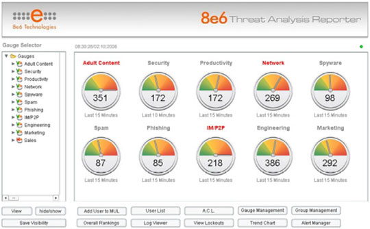
Source: https://www.perceptualedge.com/blog/?p=54
When you look at this dashboard, how do you decide what metrics are most important? The answer is you can’t. Everything is sized exactly the same with the same font/boldness.
In order to show your data more effectively, you need to put the important metrics up top in a larger font or a different color. It should be obvious to you which metrics are priorities.
Now this is more like it:
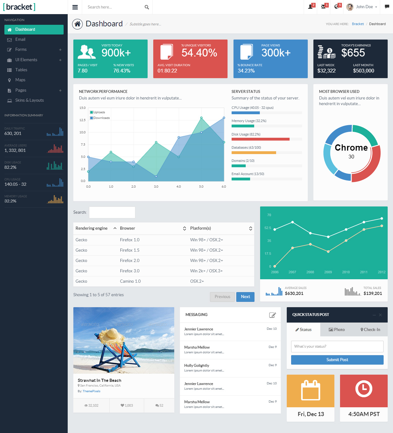
Source: http://www.responsivemiracle.com/collective/best-responsive-html5-admin-dashboard-panel-templates-2014/
The key metrics draw the eye first through bright colors, large size, and position. Visual priority even extends to the charts: the most important one is the largest and closest to the top. The bottom line is that this dashboard design gives clear direction where the previous one did not. It gets people to look where they need to before they have to think about what they’re seeing.
5. Group Content Logically
Starting all the way back at the first step, you want the different pieces of content in your dashboard design to fit together in a way that makes sense. It should tell a story through logically organized pieces. For example, if the dashboard was for a CEO, it would likely have an executive summary component and then delve into details to answer questions like:
- Where have we been (past data)?
- Where are we now (current data)?
- Where are we going (forecast data)?
Other ways to group dashboards include by department or by functional area. For example, you could have financial data on one tab, pipeline or renewal data on another, and operational data on a third. If you have a mix of departments on the same page, the departments that are the same or similar should be grouped together physically. The grouping within the pages should also have the right amount of white space and symmetry. Pay attention to the way it looks, and again, make sure it tells a story.
Here’s an example that brings it all together:
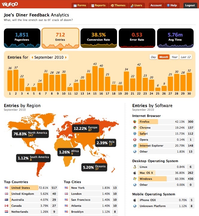
Source: http://www.matillion.com/uploads/2015/01/good-dashboard-examples-2.jpg
You can see by looking at this dashboard what the important metrics are since the percentages in the map are called out and the important metrics are on top. The data is also shown in a logical manner. The entries are clearly grouped by software, region and dates (day, month, year). There is also adequate white space between groupings.
Conclusion: Next Steps for Dashboard Design
As you can see from the examples we’ve discussed, dashboards can open up worlds of data you never thought you’d be able to access. They give you the design options needed to create actionable, intuitive, and beautiful displays that put information where it’s needed most.
Need to pitch dashboarding to your coworkers? Take a look at the SlideShare version of this article to get a dynamic presentation that will back you up.