Introduction to Using RAVE Visualizations in Cognos 10.2.1 Active Report

Rapidly Adaptive Visualization Engine (RAVE) is the technology behind IBM’s extensible visualization offering. With the ability to create your own visualizations and to utilize those that others have created, the bounds of what have historically been accepted as the limits of IBM Cognos charts and graphs are gone.RAVE visualizations are far more advanced than what we are accustomed to. They are interactive, animated and are available in more variety, including heat maps, spider maps, tag clouds, bubble charts etc. In this article, we’ll take a look at where to acquire and how to start using RAVE visualizations. You’ll find that it is surprisingly easy to implement in just a few short steps.
Where to get Visualizations?
At present you can download the new RAVE visualizations at IBM’s site http://www.analyticszone.com by going to the Downloads tab and selecting the extensible visualization link on the far right.
Here you’ll find a nice variety of the types of visualizations that have already been created. Select the visualization that you’d like and download it (You will need to be registered on this site). The download will manifest itself in the form of a .zip file.
You can also join Many Eyes, an online community where these visualizations are shared and developed.
Installing Visualizations
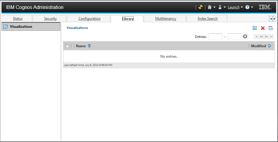
IBM has made the installation process easy. No editing XML files or shuffling content around your installation directories. To install these visualizations simply go to Cognos Administration and select the Library tab shown below.
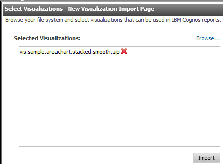
Select the Import Visualizations button (  ) and browse to your downloaded visualization zip file.
Click Import.
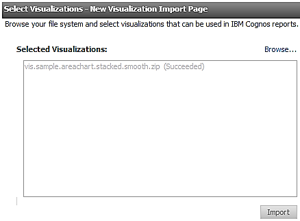
Note: There is no need to restart services after the visualization(s) are imported.
Using Visualizations in Active Report
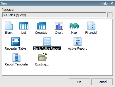
Now that the visualization is installed, let’s make our way over to Report Studio and create a Blank Active Report.
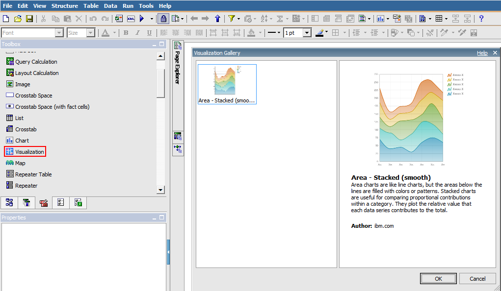
You’ll notice there is a new Toolbox item called Visualization. We can drag and drop that into our page and find that we can now browse our gallery of visualizations from within Report studio. At this point we are back into known territory and can utilize Report Studio to populate data and format as we see fit. As with all IBM Cognos charts (both legacy and current), each type of visualization may have their own unique set of formatting options and functionalities.
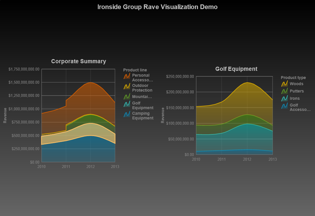
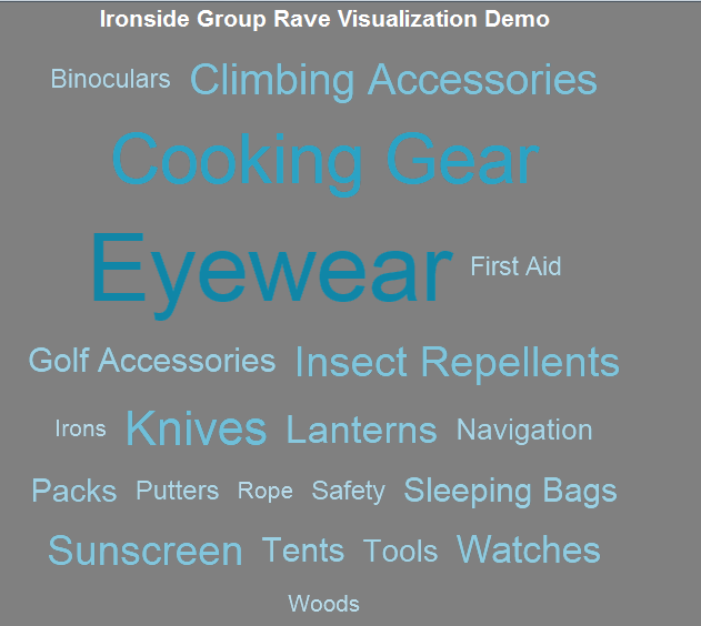
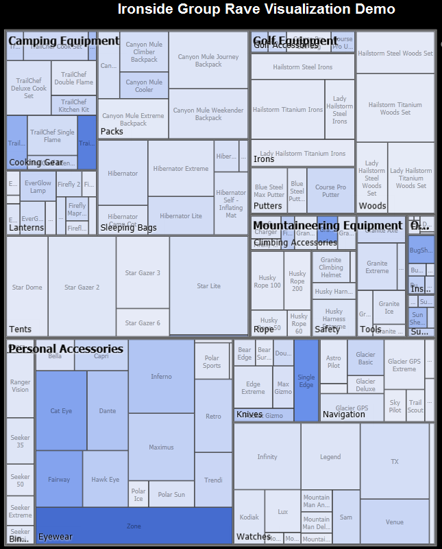
Below are screenshots of some Active Reports were created using GOSALES (query) data.