Why Your Dashboard Sucks: Design Thinking at Gartner BI
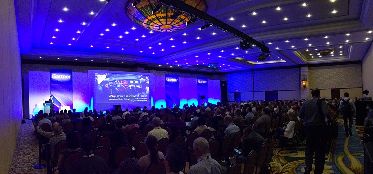
This year at the Gartner BI & Analytics Summit in Grapevine, Texas, Ironside’s own Greg Bonnette delivered a presentation that got his audience questioning just what it is that makes a good dashboard. During his talk, Why Your Dashboard Sucks, Greg used the all-too-familiar staple of BI development as a gateway into a much wider discussion of design thinking and its applications in a business analytics setting.
Highlights included:
- Emphasizing the disconnect between consumer and enterprise applications and explaining why it doesn’t have to be that way
- Defining user experience beyond just talking about a UI
- Broadening the focus of BI activities beyond technology and traditional problem solving
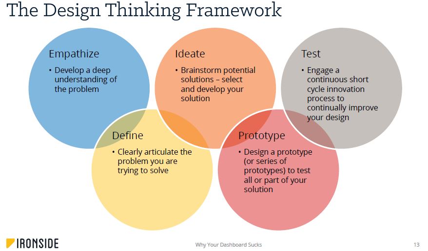
- Showing dashboards as they were meant to be – a manifestation of the five phases of design thinking
- Driving home the purpose of aesthetics
- Using real-world use cases to illustrate design thinking in action
Setting the Stage: Why Design Thinking?
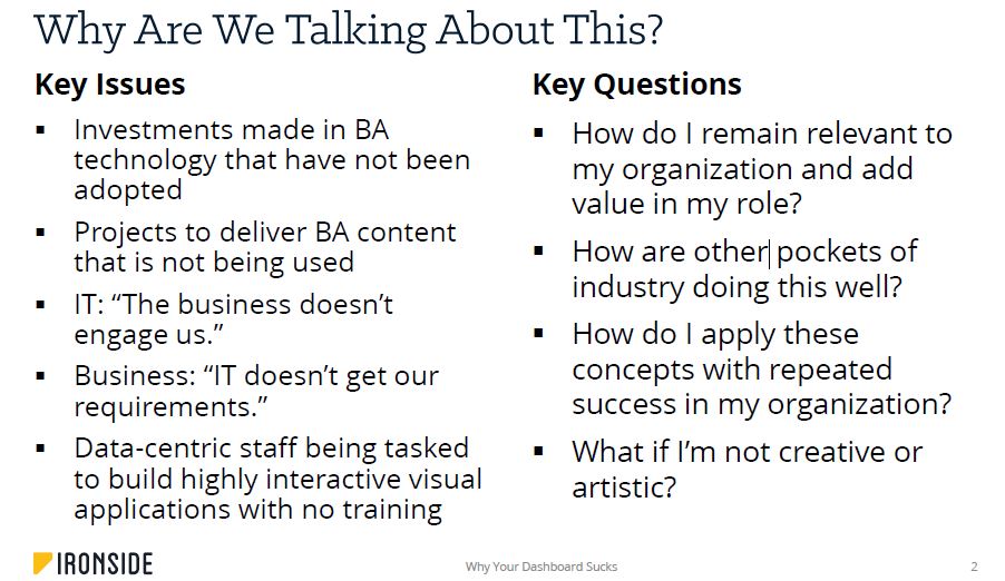
Greg started by laying out the key issues that lead to discussions around design and dashboarding at organizations and the questions those issues raise. Turns out it comes down to the same thing as so many other analytics problems: the differing perspectives between business and IT stakeholders. IT comes at the problem from a data-centric angle while business thinks in terms of goals and requirements that change over time. This often results in miscommunication and technology investments that don’t get adopted because they’re not seen as relevant to the immediate concerns of the day.
“We love our consumer experiences,” Greg asserted, “and then we come to work.”
Design thinking gets past this miscommunication. It replaces the highly developed, data-centric, and long cycles of development famous in enterprise analytics with value-driven, user-centric, and short cycles that are iterative and flexible. When you prioritize people and ask why they need what they’re asking for instead of a specific piece of data, you begin breaking down the barriers dividing departments. That was the main message of Greg’s introduction.
The Bigger User Experience
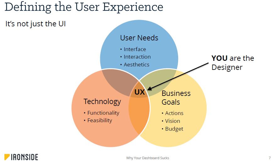
Another major point of Greg’s presentation was around understanding just how much user experience covers. A nice UI is only the result. User experience connects user needs, technology, and business goals. It’s the center point that brings all the priorities shown above together and makes them interpretable and actionable. After all, the goal of most BI exercises is an action of some type, and even if we have all the data in the world and can pull it from our data stores it won’t result in action if it isn’t presented understandably.
Traditional BI Thinking vs. Design Thinking
Greg made it a priority to show how traditional BI thinking follows a linear requirements > development > deployment model and how design thinking reaches beyond that. Instead of just receiving a business requirement, pulling data into a table, and pushing that off to the requester to read through, design thinking asks for more. It tries to see from the perspective of the person asking the question, find the real motivation behind the question, and iterate prototypes for addressing the need until the right fit is found. Greg dug into each of the design thinking phases in his presentation to show the details of the process.
Real-World Use Cases
To make the principles discussed in Why Your Dashboard Sucks real for his audience, Greg told several user stories from different industries that solidified the design thinking process in the minds of those listening. He discussed three unique perspectives:
- Health Insurance: Centralizing core business impact, enrollment, distribution, and demographic metrics to allow quick synthesis with limited customer access
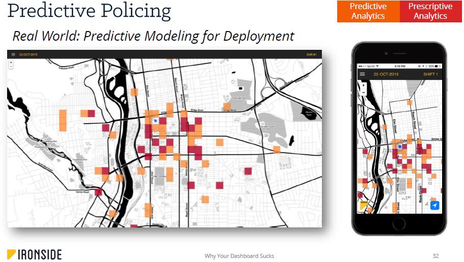
- Law Enforcement: Visualizing predicted areas of high crime on a map of a department’s jurisdiction to let officers be in the right place at the right time to prevent crime
- Financial Services: Implementing an agile methodology for translating a complex, nuanced business and data model into a rapidly deployable visual solution that resonates with users
So What’s It All Mean?
The bottom line is that there are several things that are guaranteed to make your dashboard suck:
- Focusing on particular data questions instead of the reason they’re being asked
- Building to your standards instead of your users’
- Delivering data without context
- Packing too much into a single display
- Making design decisions for no particular reason/without testing them
Ironside chose this design-focused approach for the Gartner BI Summit because we wanted to explore the two elements that hold analytics together: design and governance. In an increasingly rapid and bimodal space, it’s critical to empathize with the people consuming your data and prioritize speed to value/action. Knowing your data’s quality only goes so far. You also need to make that quality relatable, showing true care for the business goals it’s supposed to address and the people who generate those goals.
Download Full Presentation Slide Deck
Complete the form below to get a copy of Greg’s presentation.
If you’d like some more resources on dashboard design/design thinking, we’ve got a ton to choose from. Check them out: