Gantt Charts Using Cognos 10.2.1 RAVE Technology

The IBM Rapidly Adaptive Visualization Engine (RAVE) is a new tool introduced in Cognos 10.2.1. The engine can run on the server or the client, allowing for the dynamic creation of both static and active charts. Additionally, visualizations can be tweaked to allow for new charting options on the fly. IBM’s AnalyticsZone website provides a large number of downloadable visualizations, and one of the available options is Gantt charts. The standard Cognos 8/10 charting engine does not provide this type of chart, so this is a great opportunity to expand what Cognos can do.
To create Gantt charts using RAVE requires Cognos 10.2.1 or newer. Additionally, an administrator needs to download the Gantt visualization from AnalyticsZone and install it in the local Cognos installation. Click here for a previous article with more detailed instructions on downloading visualizations.
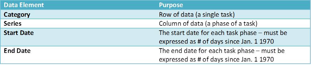
Gantt charts usually show a timeline for various tasks, with each row representing a single task. If tasks are broken into parts, those parts appear on the same row, each with a different color. Gantt charts use a different type of data than most reports. Transaction data, such as orders and sales, doesn’t really fit into this format well. Regardless of this difference in priorities, however, there are still many situations in which a Gantt chart provides great insights into your data. In a list format, Gantt chart data might look like this:

The Gantt visualization takes each of the above columns and uses them to create an easily consumable display of the information. To ensure that the Gantt chart displays properly, you should follow the requirements described below.
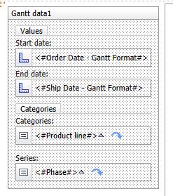
Populate All the Elements in the Visualization
Each of the visualization’s data elements must be populated before it generates. If they are not, the chart may display with no data or may take a very long time to generate. If you are trying this visualization and the report takes too long to run, make sure you filled in all the data elements! The table below shows the four data elements that structure the Gantt visualization.
Knowing what information to enter in these fields is not always intuitive. Be sure to take the following guidelines into consideration when filling them in.
Don’t Use Dates in the Start Date and End Date Fields
It is very important to note that the Start Date and End Date fields do not actually take date values – they take a number equal to the number of days since January 1, 1970. These values are converted to dates internally and used to create labels for the visualization. Cognos can convert dates into numbers using the _days_between function, as shown below:
_days_between([Date Query Item], 1970-01-01)
If you expect to be using a lot of Gantt visualizations, it may be worth adding this calculation to your warehouse’s date dimension so that report users can drag and drop it onto their reports. Ideally this would be placed as a field in the date dimension database table, but you could also add the calculation in Framework Manager.
If your data does not contain a series (for example, if each task has only a single phase), create a query calculation with a static text value and place it in the Series element of the visualization. If you leave this element blank, the chart will not render.
Change the Label Value Ranges
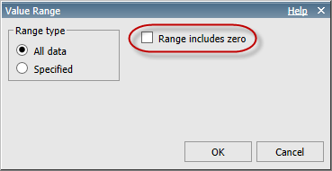
The initial value ranges for the chart labels should be changed. By default, the visualization includes data down to zero, which in this case means time values all the way back to 1970. You can change the Value Range property by selecting the Start date or End date field in the visualization and then clicking on the ellipsis next to Value Range under General in the Properties pane.
In the Value Range dialog, make sure that the “Range includes zero” checkbox is unchecked. This needs to be done for both the Start date and End date elements.
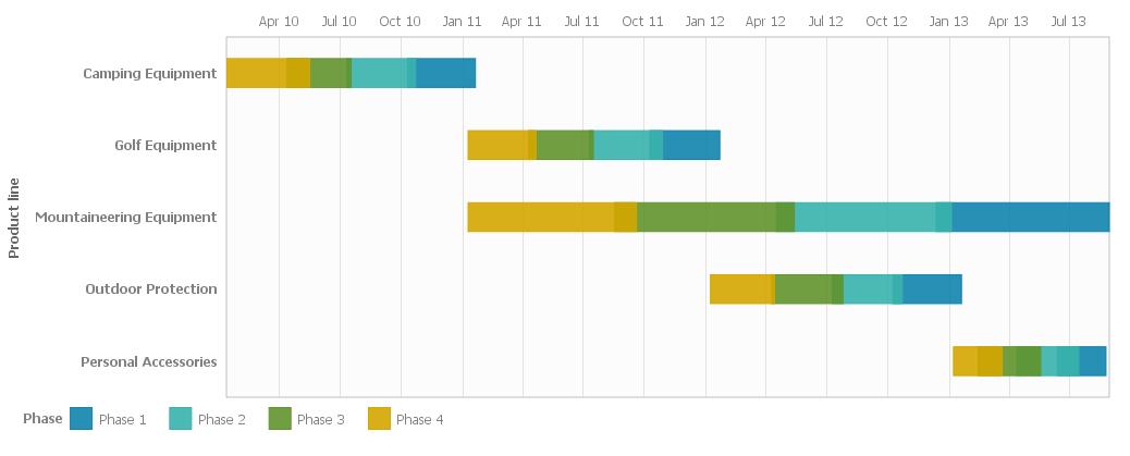
Sample Gantt Chart Using GO Sales Data
To provide a good example of a fleshed out Gantt visualization, we’ll create a chart using Cognos’s GO Sales sample data set. This data is not really designed for Gantt charts, so we’ll do some creative grouping in order to create something more appropriate.
Open Report Studio with the GO Sales (query) package. Create a blank report (there is no “visualization” report template, so a blank report is usually best when using RAVE).
Note: If you are running Cognos 10.2.1, RAVE is only available in Active Reports. Create a blank Active Report instead; all the other steps are the same.
Open the query in the Query Explorer and add the following data items:
• [Sales (query)].[Products].[Product line]
• [Sales (query)].[Time].[Date]
• [Sales (query)].[Time (ship date)].[Date (ship date)]
• [Sales (query)].[Time].[Year]
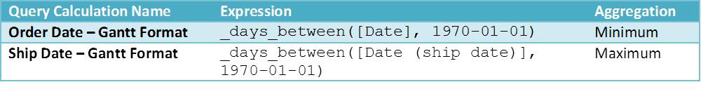
In order to meet the format requirements for the Gantt chart visualization, we need to add two query calculations that transform the dates into “days since Jan 1 1970” values:
Make sure to set the Aggregation property for each query calculation as described above. This will combine the many orders in the GO Sales data set into a small number of groupings, which is more appropriate for a Gantt chart.
To create a series for this data, we will use the quantile function to split the orders into 4 groupings. (The quantile function breaks up data into some number of segments and returns the segment that each data item falls into.) Create a query calculation called “Phase” with the following expression:
'Phase ' + CAST( quantile(_days_between([Date], 1970-01-01) , 4
for [Product line]) as varchar(10))
Set the Aggregation property for this query calculation to None, so Cognos knows to treat it as an attribute.
To make the data look more like a “waterfall” project, where different tasks happen after each other, add the following filter expression:
([Product line] = 'Camping Equipment' AND [Year] = 2010)
OR
([Product line] = 'Golf Equipment' AND [Year] = 2011)
OR
([Product line] = 'Mountaineering Equipment' )
OR
([Product line] = 'Outdoor Protection' AND [Year] = 2012)
OR
([Product line] = 'Personal Accessories' AND [Year] = 2013)
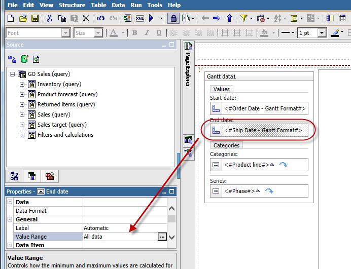
Go back to the report page and add the RAVE Gantt visualization. Make sure the Query property for the Data Container is set to the query you were just editing, and then drag the query items into the right places:

In the end the Data Container should look like this:
Note: Don’t forget to change the Value Range property for Start Date and End Date to not include zero.
By default the visualization is sized at 500×500. You may want to change this – click on the visualization and change the Width property to 1024 (or something else based on your screen size). You can also click and drag the bottom right corner of the visualization on the project pane to resize it.
Run the report and you should see a well-formatted Gantt chart similar to the one below.
As mentioned earlier, the Gantt visualization requires all fields to be populated. Try deleting the “Phase” item from the Series box and running the report again. This time, you should see a chart with the right date range, but no data. For data not in a series, you can add a query calculation with a constant value (like ‘Project’) so that the data will display.
Gantt charts are a useful item to have in your toolbox and are very different from other chart types. When one is needed, remember the tips in this article. They will help you ensure a smooth implementation in any situation.
If you have any further questions about Gantt charts or RAVE in general, please reach out to us. Ironside would be happy to help you successfully leverage the exciting new visualization options that RAVE provides. For wider data visualization and dashboarding advice, check out the following resources:
- So What Is Data Discovery Anyway? 5 Key Facts for BI
- Get By with a Little Help from Empathy: Design Thinking Part 1
- The Dashboard Design DL
- Domo Marketing Analytics