Heat Map Formatting using HTML

Even if you don’t have access to the RAVE visualizations available in Cognos 10.2.1, there are still some options to produce non-standard charts and simulate things such as heat maps using older Cognos versions. With some creative HTML use, you can set up a heat map that responds to various conditions in your reports. This article will discuss how to implement this structure.
Report Studio authors can set up color-based conditional formatting by using the advanced conditional explorer and defining a series of requirements that trigger specific formatting changes in the report when they are met. These changes include both foreground and background colors, which can indicate to the consumer that a critical business event has occurred.
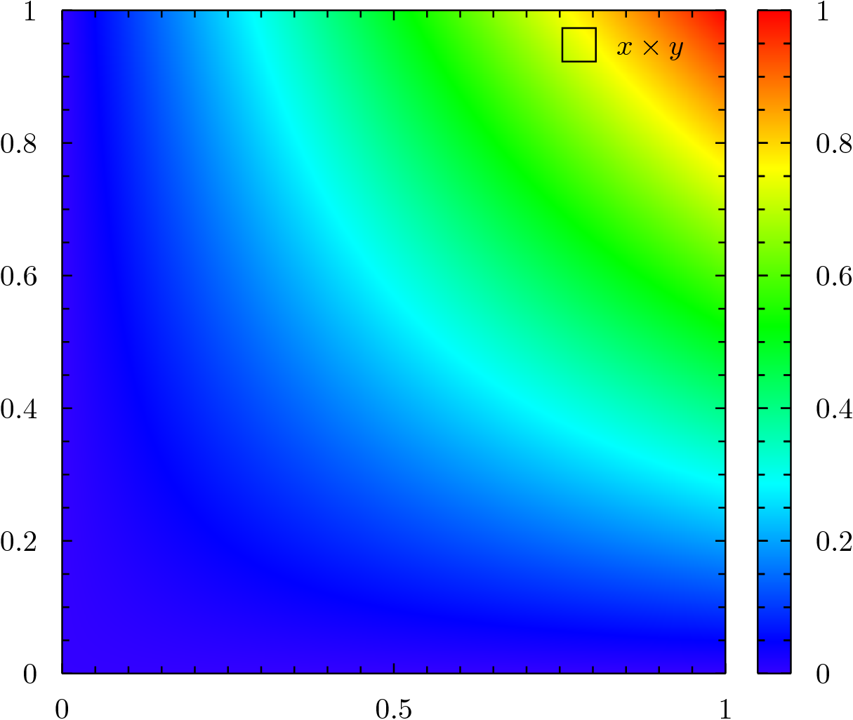
A heat map is a charting option in which colors are represented as a gradient. in this case, you can view these gradients as either a continuous series or interval data. To approximate this behavior in Report Studio, you have to create a large number of consecutive conditions that produce (with each consecutive iteration) only slight changes in color. HTML tags are a good method for putting these many small gradations in place.
Example of a Heat Map:
Mapping Data to Color Values
To make the heat map functional, you need to map numeric data values to the full range of color values. You do this by manipulating the data to fit in the range of color values to be mapped. First, profile your data so you have an idea of the maximum and minimum values. Then, develop functions that multiply, divide, add, or subtract from your data until it fits in that interval. The example below shows one possible way of setting up these functions:
RGB range to be mapped (0, 255)
Sales Data = (100000, 255000, 180000, 1000, 0)
Sales Data / 1000 = (100, 255, 180, 1, 0)
Resulting Color Values = (100, 255, 180, 1, 0)
Applying the Heat Map in Cognos
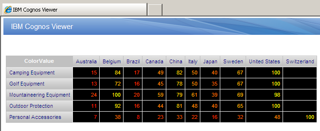
This example applies a heat map to Open Inventory values in a Crosstab where the Crosstab nodes are defined by Country and Product Line, as shown below:
Set Up the Report
1. Open Report Studio using the GOSALES sample package and produce a crosstab report. Open the Branch query subject and drag Country into the crosstab’s column drop zone. Expand the Product query subject and drag Product Line into the row drop zone.
2. Go to the Query Explorer and build the following query calculation in Query1:
[Inventory (query)].[Inventory fact].
[Opening inventory]/maximum
(total([Opening inventory]) for [Country]
This gives you an interval from 0 to 1. Call this query calculation Max Country.
Map Data to Color Values
1. Produce another query calculation in Query1 that matches the one below:
Round([Max Country] * 255,0)
This gives you an interval from 0 to 255. Call this calculation ColorValue.
2. Go back to Page1 using the Page Explorer. Make the crosstab’s default value ColorValue. This provides the crosstab with data that the HTML can reference.
3. Unlock the report and drag an HTML object from the toolbox into the crosstab cell. Define the HTML item to take a report expression, as shown below:
'<p style = "color: rgb(255,'  +    number2string
([Query1].[ColorValue])  +   ',0)">'
 +  number2string([Query1].[ColorValue]/255)  +  '</p>'
4. Run the report as an HTML file.
Generalizations and Additional Techniques
The above example only provides mapping for one value within the tuple. You can apply several different generalizations to the heat map to provide more functionality. These further modifications are described in the sections below.
Adding Multiple Colors
Producing a heat map with a single varying color requires that the data is mapped to only one of the three triples. To map multiple colors or span red to yellow to green, a report author has to map the data interval to more than one of tuple values. This is done by dividing the data interval into different parts through either an if-then or case construct. In this case, you will have multiple Color Value query items. The final result will look similar to the following:
'<p style = "color: rgb(' number2string([Query1].[ColorValue2]) +
‘,'  +    number2string([Query1].[ColorValue])  +   ',0)">'
+  number2string([Query1].[ColorValue]/255)  +  '</p>'
Other HTML Tags
The heat map is not limited to paragraph tags. Other options include table tags. The example below shows this format:
'<table>
 <tr bgcolor= "rgb(255,' + number2string([Query1].
[ColorValue]) + ', 0)">
<td>' + number2string(round(([Query1].
[ColorValue]/255 * 100),0)) + '</td></tr>
</table>'
This produces a heat map that is seen in the background of the text.
Mapping Generalizations
You do not have to directly map data to color values. You can also map data to an interval to influence how it is perceived and then map the interval to a color gradient. For example, if you are looking for outliers, you might want to convert your data to show standard deviations and then convert the standard deviations into color values for the HTML tag. This can be used to highlight the outliers in the data set and make them more readily visible.
You can also manipulate the data itself to produce changes in the gradient. The function below shows an example of this:
Data = (.10 , .50 , .67, 1)
Data * Data = (.01 , .25, .44, 1)
Data * Data * 255 = (3, 64, 112, 255)
Compare to:
Data * 255 = (26 , 128, 170, 255)
The Data * Data color gradient penalizes deviations from 1 at a greater rate as the value approaches 0. Applying this to a Red-Yellow-Green heat map would cause deviations from 1 to approach red faster than the standard data color gradient.
Ironside is a leader in the data visualization space. We provide deep insights into data discovery, best practices for design thinking, and dashboarding strategies like those in the Slideshare below.