Words of Warning: 5 Dangerous Dashboarding Terms

When planning your next dashboard project, watch out for these 5 dashboarding terms that could possibly jeopardize its success.
Introduction: Bracing for a Challenge
You already have a headache preparing for your new dashboard project. Your gut churns while thinking of the battles that lie ahead over feature prioritization, stakeholder alignment, and resource planning. With all of these things to worry about, specific dashboarding terms may sneak into your requirements; terms that can throw a serious wrench into the complexity of design, development, and ultimately the success of your project.
Learn to listen for these terms and hold meaningful conversations about why your users are requesting them.
“Supposing is good, but finding out is better.”
– Mark Twain
1. Dashboard
One would expect to hear the word “dashboard” in a dashboard project. The warning here is that you should ensure that everyone is on the same page as to what a dashboard means. We’ve heard drastically different interpretations as to what a dashboard means to our users. For example, several of our projects have started with a request for “a single page dashboard to track financial metrics.” By the time we exit our Discovery stage, the dashboard is a multi-page, multi-layer, interconnected suite of dashboards and reports. If we don’t level set at the beginning of the project, we run the risk of immediately diverging from user expectations…as well as drifting from scope, schedule and budget agreements.
So be sure to have this conversation as soon as you’re approached for the next dashboard project. Share visual examples of dashboards with each other to help communicate and set expectations.
Ironside begins with a standard communication of what we consider the purpose of a dashboard:
“A dashboard is a visual display of the most important information needed to achieve one or more objectives, consolidated and arranged on a single screen so the information can be monitored at a glance.”
– Stephen Few
We like to use the car dashboard as an analogy. It provides you with the most important information (speed, fuel, warnings) without the distraction of underlying detail. It gives you the ability to digest the current state of your vehicle, at a glance, while in the process of maintaining control of a moving vehicle.
Another great analogy is that a dashboard is just the headlines of the newspaper, not all of the articles.
2. Slice and Dice
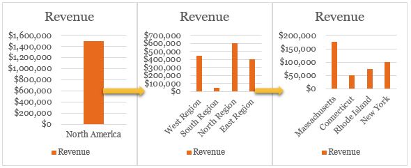
When you hear this phrase, you should immediately go back to the Dashboard section above. What is the purpose of this dashboard? If it is to be used as an analytical tool, then there may be better options than crafting a dashboard/report. If your user wants to explore data, look at it from different perspectives, and/or export it to some other system for further analysis, your dashboard design could quickly become very complex.
A great example is when our clients attempt to take something like an intricate pivot table or a spreadsheet with many filters and macros that they use for detailed analysis and convert it into an equally dynamic dashboard. The dashboard loses its focus and the user’s ability to quickly make sense of critical information at a glance is severely impacted, as you can see below.
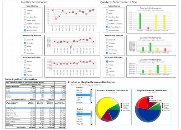
Source: Stephen Few, Perceptual Edge
Again, communicate with your users about their intended use and what problems they’re trying to solve with this tool (or more importantly, what questions they’re trying to answer) before you go down the path of design and development. If they only need to see a few different views of the data, you might be alright with a dashboard. Otherwise, explore some dedicated analysis tools from your BI vendor (or ask us at Ironside!).
3. Drill-Down or Drill-Through
These terms go hand in hand with Slice and Dice. They both can be an early indication that your users need a different type of tool. There are two issues with these terms. 1) People use them interchangeably, and 2) depending on what your users really want and what your data looks like, they could add a lot of complexity.
The fact is these terms mean two different things. Be sure to clarify with your users about what they’re trying to accomplish. Are your users trying to get a broad overview of information, like a zoomed out view of Google Maps? Do they then want the ability to zoom in on Country, State, City, or Street views to reveal more detailed information? This would be a drill-down, and interaction typically occurs on a single report element, meaning if it were a crosstab the user would see information in the same crosstab format at each hierarchical level.
Drill-through typically means users are selecting a report element and passing information to an external application. Think a dashboard (high level visualization) connecting to a detail report (tabular data). Different reports, different data presentations, different uses (high level overview vs. low level detail).
Which one you use depends on what your user is trying to accomplish. Talk with them about their use case, examine the existing data structure, and determine whether drill-down, drill-through, or another external tool is the best solution.
4. Mobile
 As enterprises integrate mobile devices into their business practices, more and more users are requesting access to dashboards via mobile device. Mobile and dashboards are a perfect pair as both are meant to deliver information quickly wherever you are. For example, Ironside developed a custom dashboard for police officers to use on patrol. It had to be simple, intuitive, and consumable at a glance.
The first thing you should clarify with your users is what they consider a mobile device. Mobile phones? Tablets? Both? The next thing you need to consider is how well your BI tool supports mobile devices. Does it have a specific app or can your reports be accessed via mobile browser? Will you need to develop a report for each type of device?
Designing for mobile devices (again, depending on how you define mobile) can be challenging due to the limited screen size and multiple device types. If you must develop for a mobile device, pick a few common (iPhone, Samsung) devices as your target platforms. Otherwise, see Responsive Design below for more detail problems.
5. Responsive Design
Finally we come to a dashboarding term that may be new to many: Responsive Design. The concept is great. No matter what device your users choose to consume information on, the dashboard is displayed to make the best use of that screen size, platform, and orientation.
“Responsive web design is the approach that suggests that design and development should respond to the user’s behavior and environment based on screen size, platform and orientation.”
– Smashing Editorial
The trouble is current BI tools do not typically support responsive design. There are some workarounds though, such as using the BI tool’s mobile app to view reports or designing for specific devices (meaning one design for desktop, an alternate design for tablet, a third design for mobile, and so on). But that means you’re generally stuck either creating multiple device-specific versions of the dashboard (and maintaining them) or building a one-size-fits-none dashboard. Both approaches introduce longer development times, additional long-term maintenance, and likely higher expenses due to the added complexity of development.
Our typical approach is to design for the smallest screen we anticipate our users viewing a dashboard on. This is generally an iPad-sized output. Then, we have the option to use the scaling capabilities of the BI tool. Success with scaling is tool-dependent, as some tools only scale the report layout but not the visualizations. This leads to awkward looking dashboards if not executed properly. So be sure to analyze your current tool’s capabilities prior to starting any projects and be sure they align with your user’s needs.
Conclusion: Dashboarding Terms in the Wild
Keep your ears open and your head on a swivel when discussing new dashboard requirements. If any of the dashboarding terms we discussed pop up, make sure you have those conversations with your users and ask questions about what they’re trying to accomplish before agreeing to execute. Doing this legwork up front, setting expectations, and establishing a clear project roadmap will lead to smoother dashboard implementations and greater user success/adoption around the asset that gets built.

About Ironside
Ironside was founded in 1999 as an enterprise data and analytics solution provider and system integrator. Our clients hire us to acquire, enrich and measure their data so they can make smarter, better decisions about their business. No matter your industry or specific business challenges, Ironside has the experience, perspective and agility to help transform your analytic environment.